The End
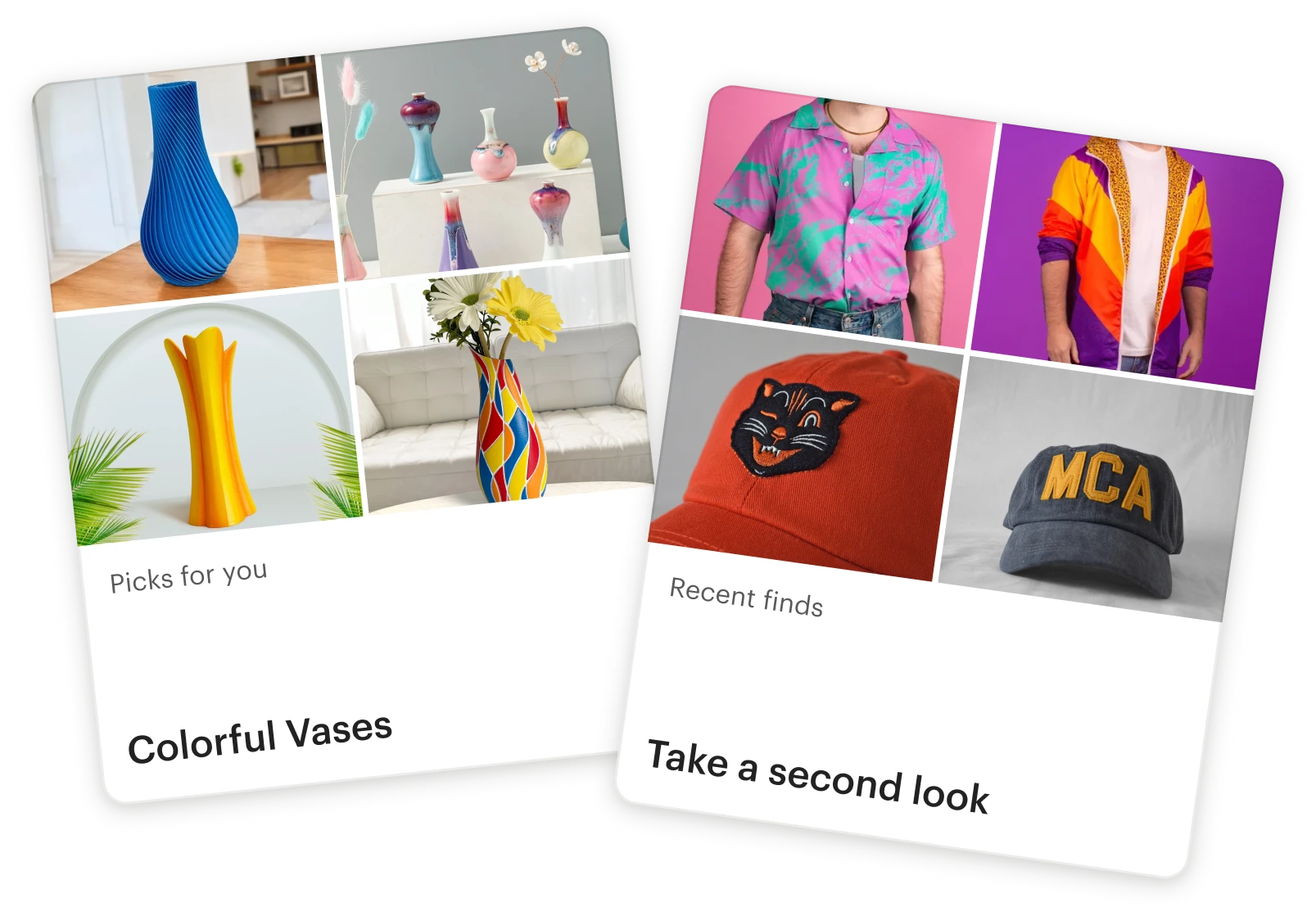
I designed a carousel-based experience that scaled to support 65,000 , all personalized and ranked for each buyer across desktop and mobile.
Impact
Sales (GMS)
Conversion rate
CTR
Jul–Sep 2025
The Beginning
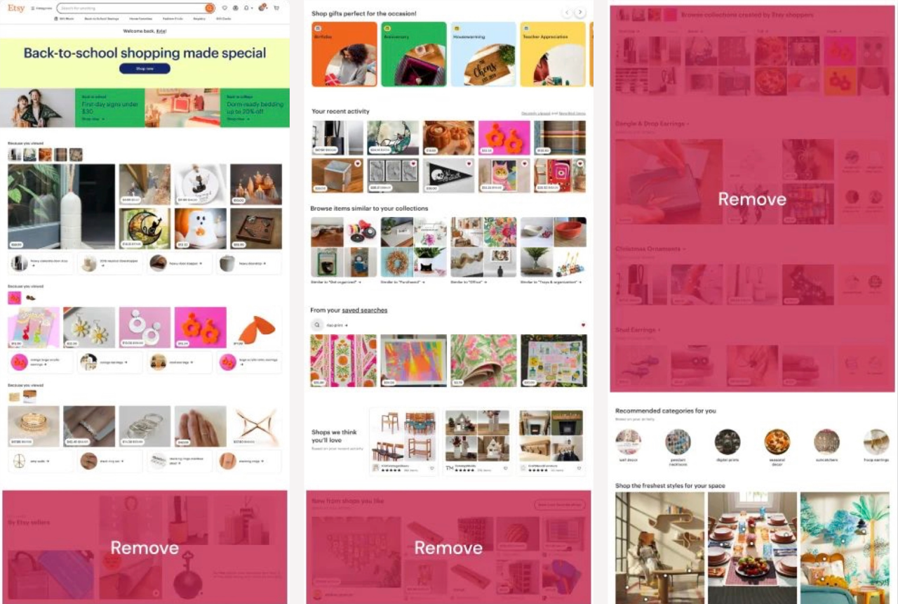
May 2024. I joined a new squad focused on Etsy’s homepage. Engagement analysis showed that discovery was a weak spot, so we started there.
In our first experiment, we removed distracting, redundant content, increasing overall engagement by 1.1%.
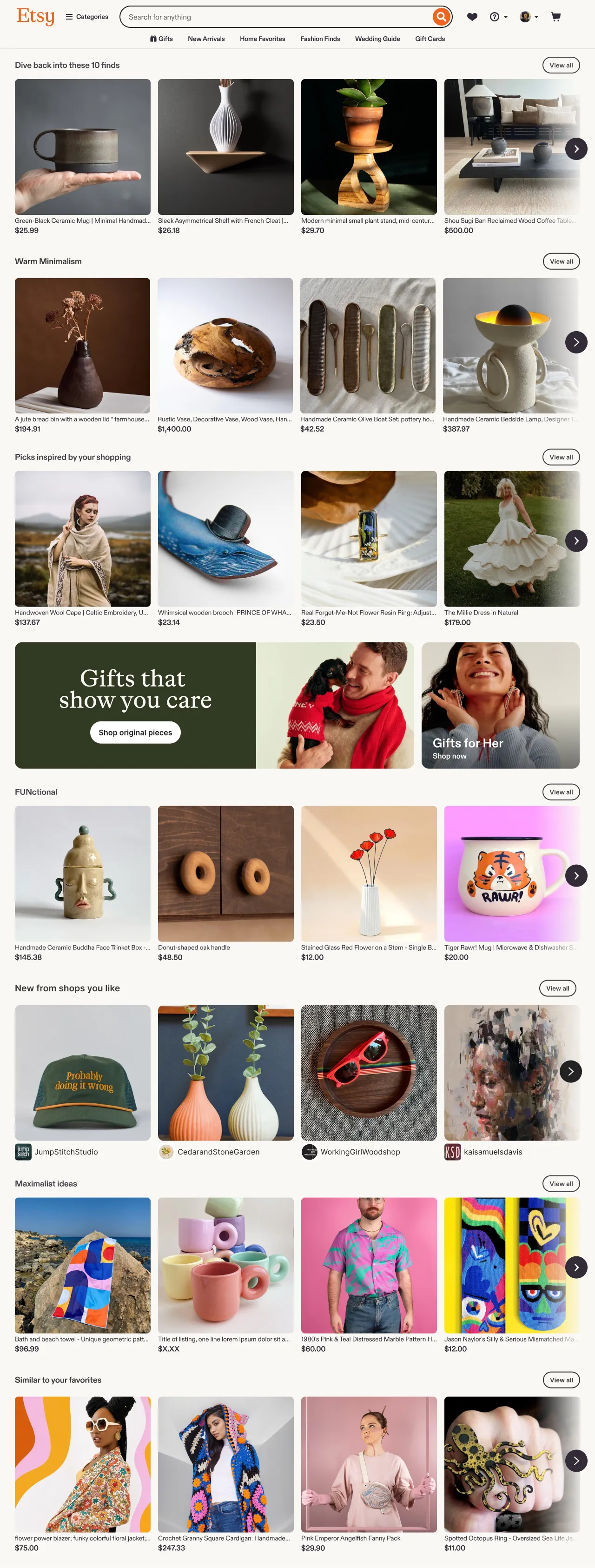
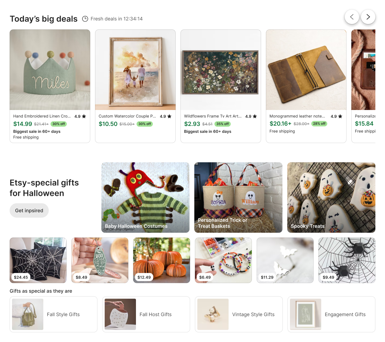
Next, we added new modules to expose buyers to more shopping ideas. The modules were dynamic, diverse, and fresh, but they weren’t personalized, and engagement was flat.
The Spark
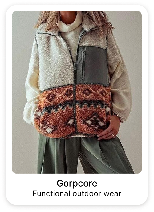
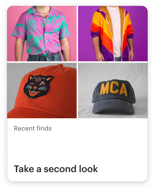
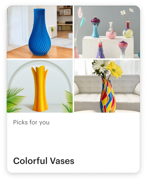
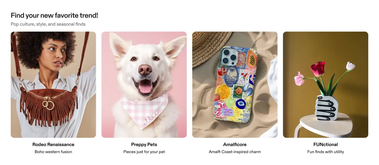
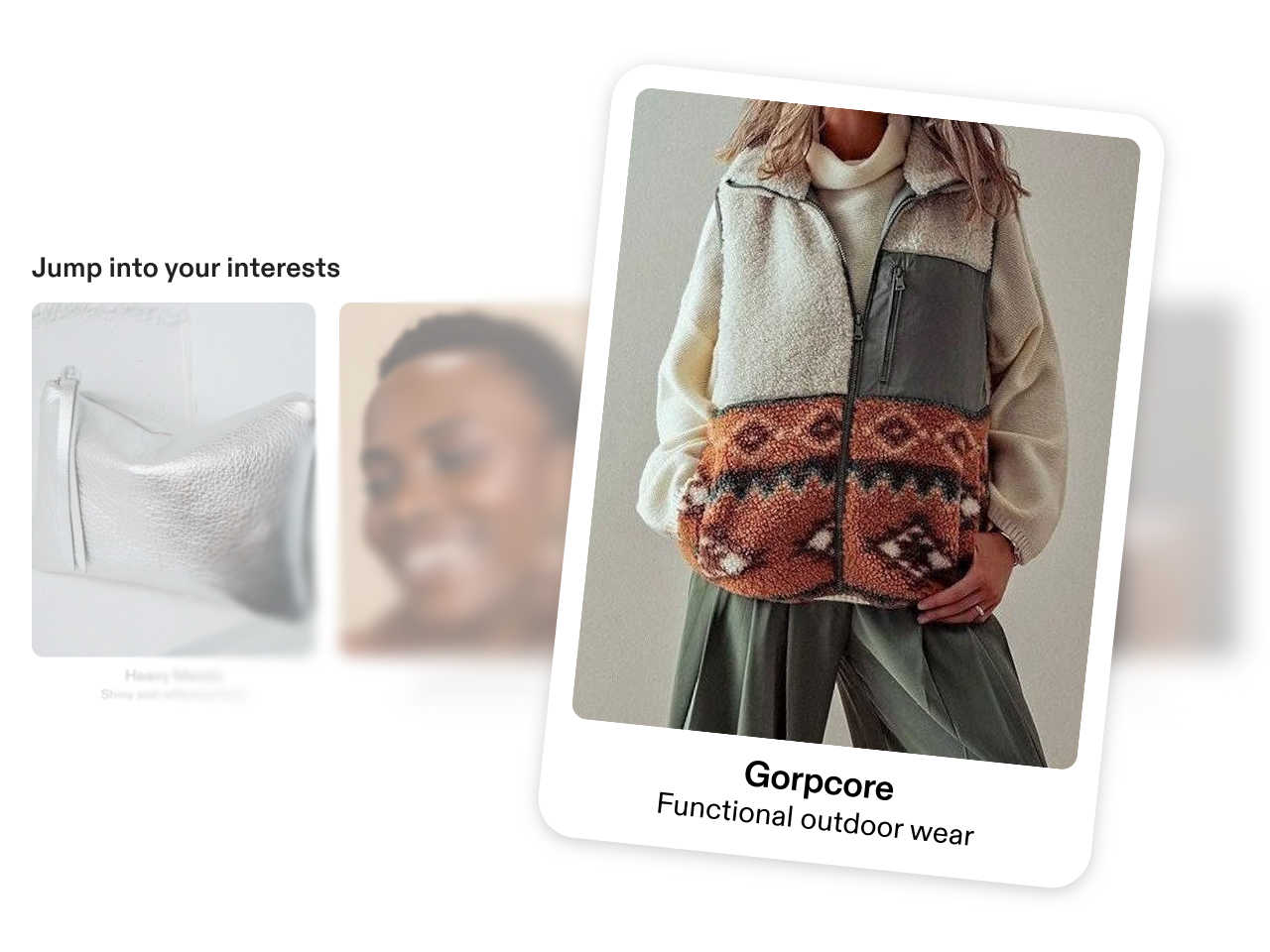
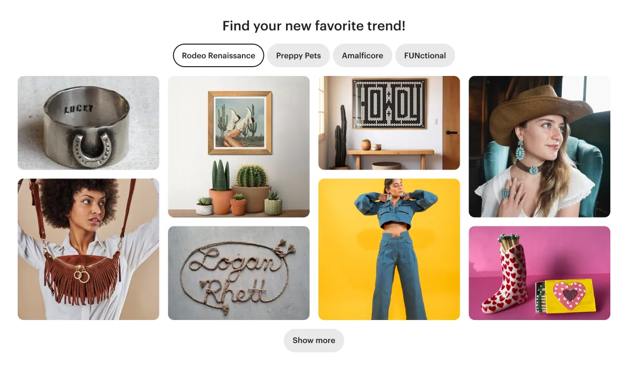
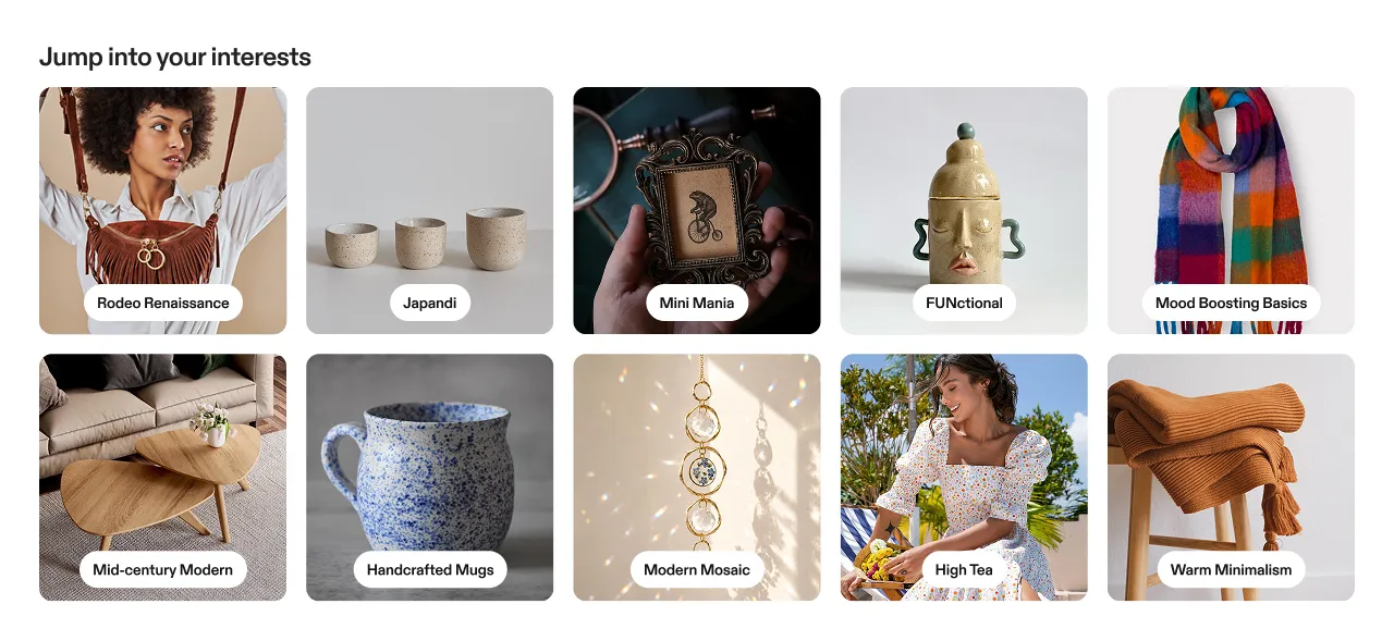
The first spark of promise for discovery content was personalized .
The combination of engaging content, personalization, and UX drove a 1% lift in homepage clicks.
The first themes dataset included titles but no descriptions, so I used Gemini to generate on-brand descriptions at scale.
Building confidence
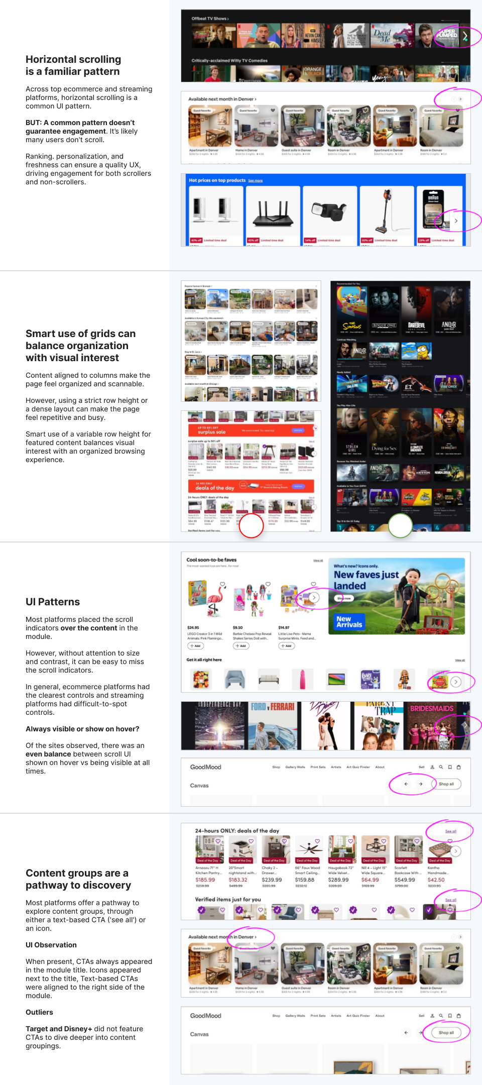
In addition to the prototype, which we used in user research, I did a UI audit.
I compared my proposed approach with best-in-class ecommerce sites, other two-sided marketplaces, and streaming platforms.
I highlighted UI and UX patterns to prompt discussion with my team and stakeholders and gain internal support for my design.
Experiment results
The first personalized carousel experiment exceeded our expectations:
We blended six personalized themes with unpersonalized content—themes had a 2.5× higher CTR.
Overall, the new experience drove more than $9.4M in sales, giving us a strong foundation to build on.
The End, Again
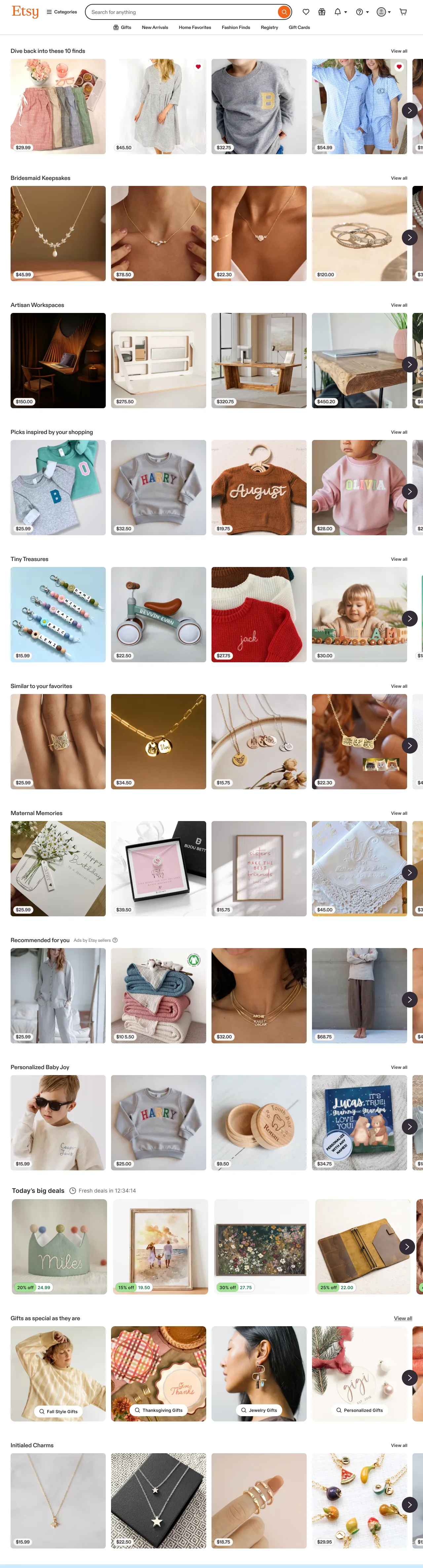
The carousel-based experience scaled to support 65,000 themes, personalized and ranked for each buyer across desktop and mobile.
As we learned how people used the new experience at scale, we improved the design, content, and data, driving more than $11.7M in additional sales.
Etsy: theme landing pages
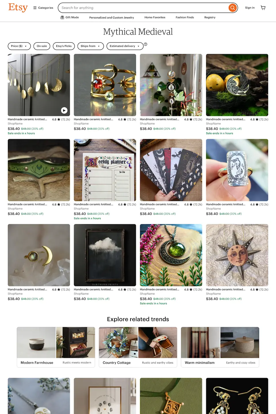
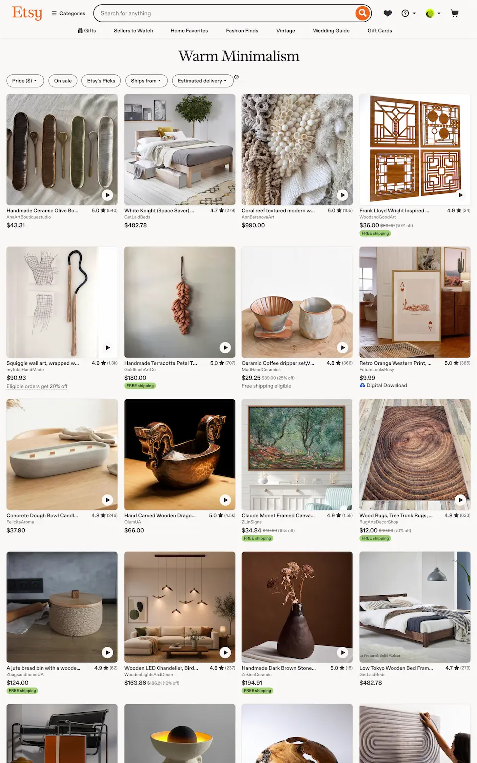
As we developed personalized themes, we realized landing pages were a weak spot in the experience—there were no pages on Etsy that supported browsing themes.
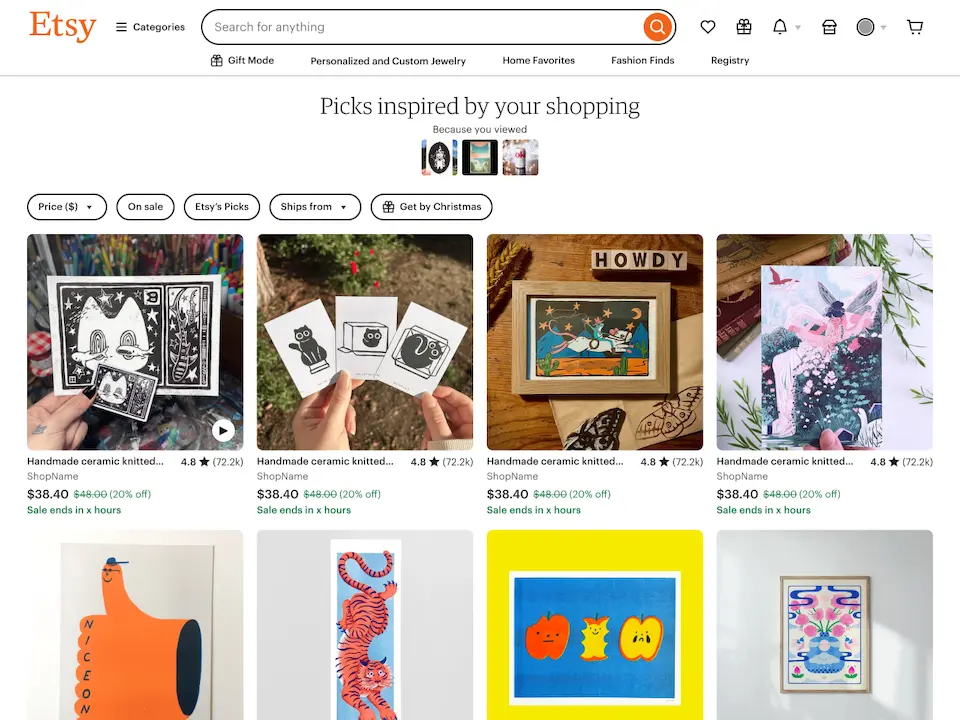
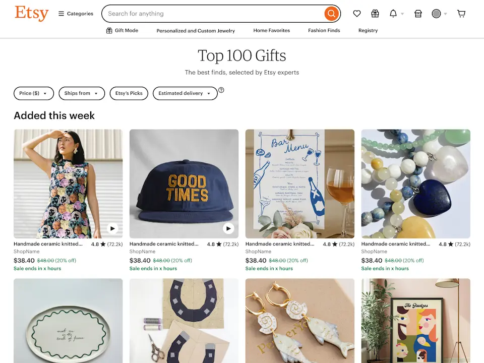
I defined the strategy for the landing pages and designed a flexible system that expanded beyond themes to support active shopping missions, similar items, and campaign landing pages for email and merchandising.
Our first experiment showed strong engagement, with a 42% CTR, so we launched the page to all users.
My PM rotation
After the first personalized carousel experiment, my PM focused on expanding the dataset from 8,000 themes to 65,000. To support that effort, I signed up for a PM rotation.
The focus of the rotation was developing and launching Home Hub, a feature that condensed recent activity into a compact module at the top of the homepage.
I wrote a full PRD, defined measurement goals with our analyst, planned experiment scope and deliverables with the lead engineer, and analyzed the experiment results.